I wrote a 5 minute commentary for our film. I used old archive footage of our film, converged with images from real media texts that we used as stimulus and stills of our film.
Tuesday, 8 February 2011
Tuesday, 25 January 2011
film title
I used the skills that I learnt over the creative process, to create the films titles in Adobe After Effects.

This is the first draft of the titles that I made.
 This is the second draft version.
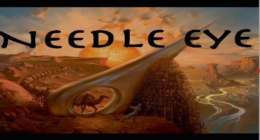
 This is is the final version of the title. I obtained the fonts from DaFont.com and animated and created the title in Adobe After Effects.

This is the first draft of the titles that I made.


Monday, 24 January 2011
After effects fade
I used a tutorial from Youtube to overcome a problem I had with after effects, rather than pondering over the situation, I used the internet to solve the problem.
Wednesday, 19 January 2011
Production Logo
I created the production logo using Adobe After Effects. I used a tutorial as a foundation.
 I got the background image from the internet. I used a pre-installed font form After Effects.
Tuesday, 14 December 2010
the questionnaire
I made a questionnaire for our group, to ensure that we could have feedback for our screening and so we could pinpoint the exact issues we had mad tackle them effectively.


Tuesday, 7 December 2010
Yesterday's lesson
I made a powerpoint to represent our groups' film.
This is the powerpoint.

Within the powerpoint I highlighted the theme, narrative, Inspiration, Location and Characters. I wanted the powerpoint to fit all of the information.
This is the powerpoint.

Within the powerpoint I highlighted the theme, narrative, Inspiration, Location and Characters. I wanted the powerpoint to fit all of the information.
Monday, 29 November 2010
Film Poster Mock up

This is my Mock up Film Poster. I wanted to makes sure that the poster incorporated elements of the genre and our film. I did not want the poster to reveal to much of the narrative away, but I wanted to draw interest to the Target Audience. I did not want the image to appear to cheerful, because that would not reflect the nature of the film's narrative and characters. But I did fill the colours for elements that would need colour ( The Sun, The Trees, The background buildings).
I tried to follow the conventions of a film poster, by placing each elelment of the poster in a traditional way. This includes having the credits and realted information at the bottom. Also I had the tagline at the top of the page, to ensure that the target audience would see it before the title, but also ensure that this would make the audience look at elements of the poster as a sequence. Firstly, reading the tagline, then looking at the background image, then the foregroubnd image, then the title and then finally the release date and cast information. I made the image of the main character medium sized in relation to to the rest of the poster, to signify the closeness of the character in relation to the audience. This poster is susposed to create a sense of mystery for the audience and I assume that this poster will appear more serious, representing the genre and the narrartive. Due to this I think that the audience will be a mature audience, because Children or young adults may not find the poster very appealing,unless the youung adults are Media or Film Studies students, because I think that is the only way the poster will appeal to them. I chose to make the poster Horizontal, because this partucular poster is for Billboards, which are conventionally horizontal, I wanted make a poster that could be seen by the general public, not just the target audience.
Subscribe to:
Comments (Atom)